Branding
BOOMTOWN SWEETS
Categories
Branding | Print
Boomtown Sweets, formerly Brittany’s Sweets and Treats, needed a new look and new name. This project included creating a whole new image and some print products to match.
Creative Process
The first step in the rebrand was a consultation meeting to get a good idea of what the client envisioned. She needed a new name and new logo to start with.
Sweets and Treats almost turned into B’s Sweets with a bee logo, but looking further into the name, we found a few others out there.
I got a text asking, “Totally random, but what about Boomtown Sweets?” Ooh yes. Now that was a name that encompasses the ups and downs, craziness, and grit the people of the Permian Basin endure, with the contrast of her sweet confections in just two words.
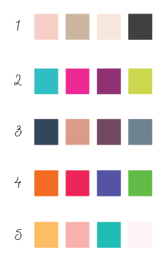
It was back to the drawing board, literally, as I put together a mood board and created a few different color pallets to see what caught her eye. The client liked a mix of brighter colors and pastels.
I envisioned something modern and fun using inspiration from a candy store, with a nod to the crude this town booms on.
The client’s signature desserts are her cake pops, so finding a way to include them was important.
Color Schemes
First I built a mood board and built a few color schemes to start the design process. These colors will be used throughout the brand and convey a mood of their own to customers. This client liked a mix of pastels and bright colors, so the final pallett choosen was #5.
LOGO CONCEPTS
The three logo concepts I presented were based on the mood she was trying to capture.
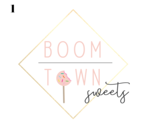
Logo 1 had a gold framing and pastel inspired by a design she shared early in the process. It also included the cake pop to showcase her specialty.
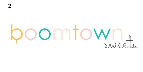
Logo 2 was a mix of pastels and bright candy colors. The drips represent the drips of icing on her treats and the crude oil of our boomtown. “Sweets” has a retro feel to it like that of a vintage candy shop.
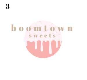
Logo 3 has a sweet vibe from the colors, and focus on her signature cake pops.
Final Product
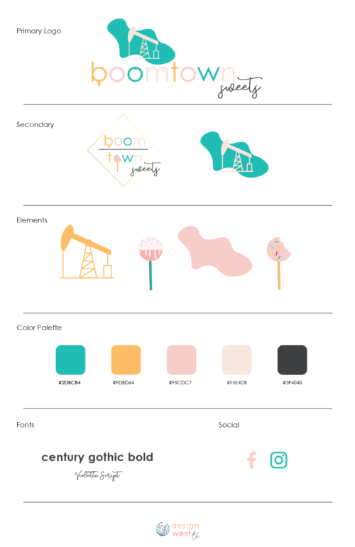
The client liked both 1 and 2 and couldn’t decide, so I blended the two and made one primary and one secondary.
She also felt something more to represent the oilfield was needed, so I added a funky pumpjack and sent it off for approval.
I also included some other elements for her to use that matched her brand.
Once she was completely satisfied with the design, I sent a PDF with her brand guidelines, multiple files of each logo and created matching social media profile graphics for her Facebook and Instagram.
Additional Print
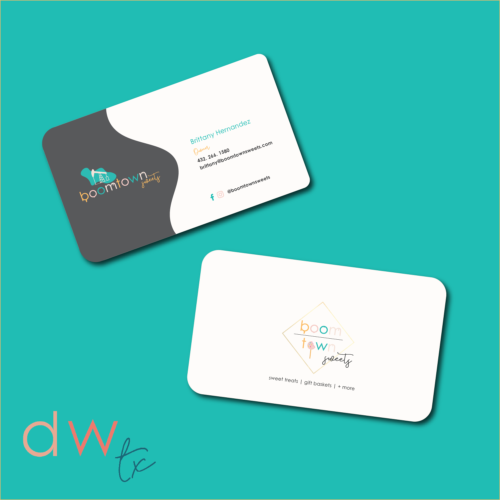
She needed a menu and some business cards to show off her new brand to clients. I created some double-sided business cards printed with rounded edges on premium cardstock with a glossy finish.
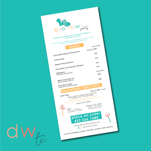
For the menu, it was printed one-sided on high quality glossy paper as well.
